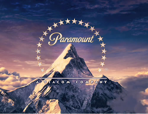
Idents can be key to creating the right setting/feeling for the audience within the opening sequence, here are two common ones from big production companies and how we will be using factors from theirs in our own ident.
This ident is from the company 'Paramount' this is a well known brand and the ident connotes lots of things to the audience. The main thing this ident makes the audience think is that this company is majestic. this is shown by the use of a peak of a mountain, towering above the clouds and is clearly the highest and biggest thing around that particular area (can relate to the film industry) this is also emphasised by the use of stars around the main logo. the stars can relate to the company's success. the typography used in the logo is also very majestic and royal.
This ident is for 20th century fox, a film company which has lots and lots of films/tv programs under its name. this ident is a very powerful one and instantly tells the audience that this company is a 'big deal' this is shown to the audience by the logo being a big golden statue with spot lights shining on it. this also shows the audience what the film company may think of it self as this ident is almost boasting.
in our ident we are going to incorporate things such as majestic typography and making our logo a big deal. but we are going to stick to the creepy side of things and use a creepy eye (relating to our film/voyeurism) which moves and then our logo will appear. this will relate to our film and will set the scene for the opening sequence. the audience will not feel uncomfortable with the change from ident to opening sequence.


No comments:
Post a Comment